On this page · 7 sections
I’m not a designer. I had a PDF of a zine-style layout I liked (lime, violet, chunky italic headings) and a WordPress install. A few weeks later I had the site you’re reading. Most of the work was done with AI, but the process mattered more than the tool.
The order that worked for me:
- A reference, not a prompt.
- Design boards before code.
- The brand as a system.
- The theme from the boards.
- Review rounds against the boards.
- A design system to keep it consistent.
1. Start with a reference, not a prompt
“Make me a cool tech blog” gives you something generic. A real reference, like the PDF, gives the AI something to be specific about: the colours, the type, the way headings tilt. I asked for two directions based on it, picked one, and dropped the other completely.
2. Design boards before code
The first output was a design canvas, not a theme: home, article, about, three post layouts, mobile versions and later a native-app style mobile view. Changing a board costs minutes. Changing a theme costs hours.
3. Brand as a system
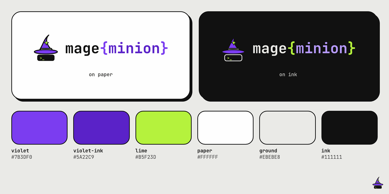
Once the name MageMinion stuck, the logo merged two of the ideas the AI had proposed: a wizard hat dropped over a terminal prompt, beside a monospace mage{minion} wordmark. The hat drop became the page loader. The first version was too lively, so I asked for it calmer, and it got better.
4. Theme from the boards
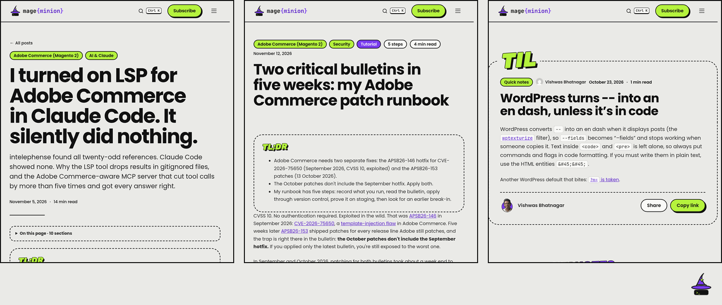
The boards turned into a Blocksy child theme with block patterns, three post layouts chosen by category, and a demo content importer. Then a handoff document let Claude Code implement it in my local WordPress.

5. Review rounds against the boards
This is the part people skip. I had the AI review the local site against the boards, on desktop and phone, and write fix lists. Two rounds caught a broken heading in a narrow box, a stray comma in a category chip, a featured title pushed off the first screen on phones, and a header that showed the site name twice.
AI is fast at making things. It’s also fast at checking things. Use both.
6. A design system to keep it consistent
The tokens, type styles, components and logo rules went into a design system, so new pages and future posts follow the same rules without me remembering them.
What I’d tell another non-designer
Bring a reference. Review everything on a real phone. And when something feels too much, say so. “Tone it down” is valid design feedback.